
SUMMARY
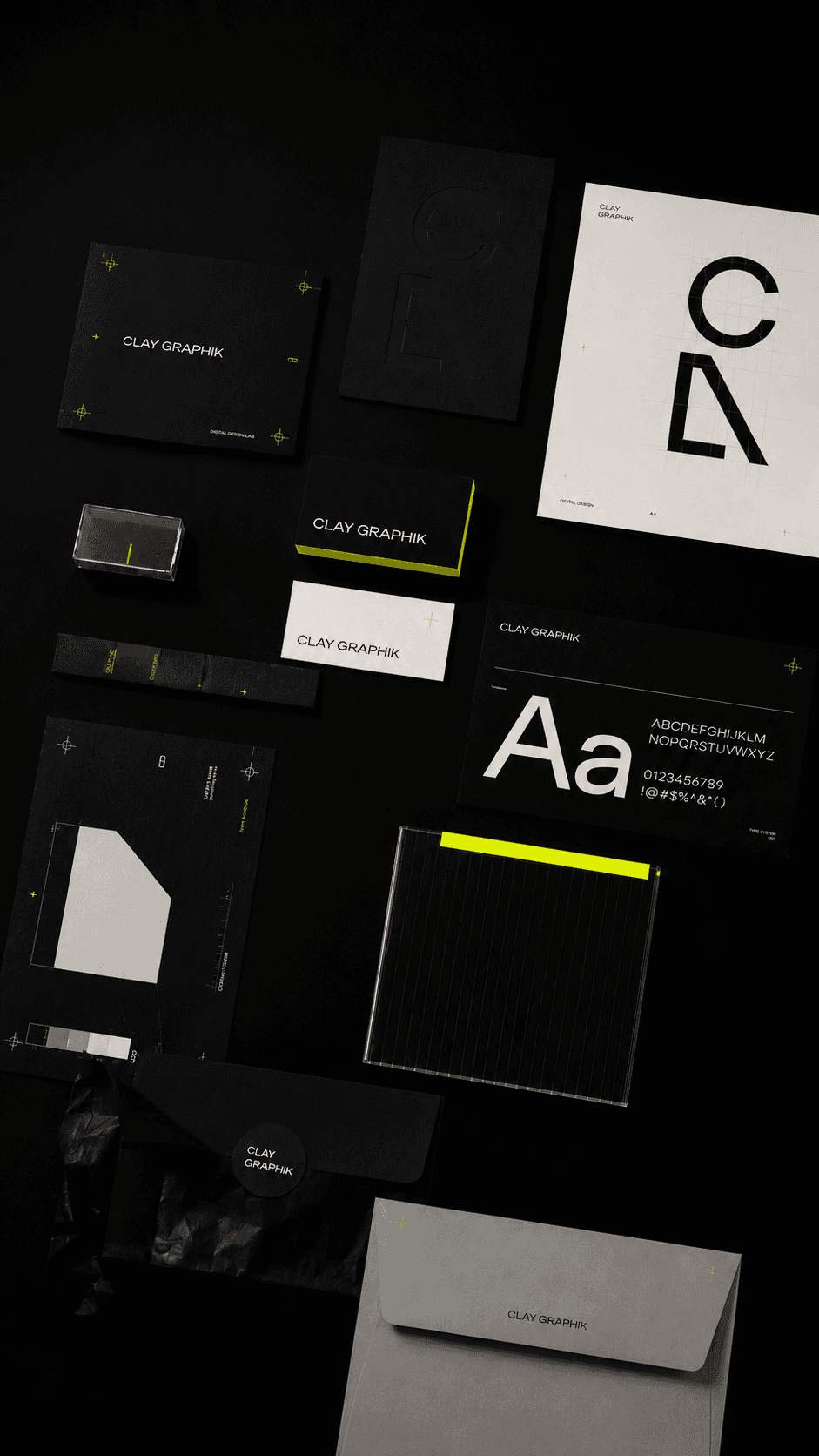
A complete identity system study — mark, palette, type and applications — built to keep a brand consistent across every touchpoint.
OVERVIEW
A brand is only as strong as its consistency. This studio concept documents a complete identity system: how the palette, typography and layout rules work together across print and digital.
OBJECTIVE
Keep the system strict enough to feel premium, yet flexible enough for a growing business to apply it without a design team on call.
APPROACH
We defined the core tokens first — colour, type, spacing — then built a library of repeatable layouts and components that enforce the system automatically.
SYSTEM
Neon lime as a strategic accent on carbon and off-white, Hanken Grotesk for display, JetBrains Mono for technical labels.
DELIVERABLES
- Brand mark usage
- Colour & type system
- Layout rules
- Application examples
OUTCOME
A clearer, more consistent visual presentation across the brand's key customer touchpoints.